

Hey! Longtime no see. It’s been almost two months since the last one, sorry for the wait! Life’s been real busy since my move getting adjusted to the new place and everything that comes with moving, and I want to take the time to make sure these are worth the read! Today I’m delving into the process of how I’ve done most of my painting the past few years. I always think it’s interesting to see the process that different artists use to make their work so I kept track of most of the steps through working on this painting and wanted to share it here. I’ll have another update probably within a week or two with a lot more artwork that I’ve been working on, so stay tuned for that one coming up as well! Without further ado….
From Now Until Then Art Show
I’m psyched to be included in an art show at Worship Tattoo in Portsmouth, NH tonight; August 23rd from 6pm-10pm. Erick, Mike, and Jebb (that I work with at Redemption Tattoo ) are also apart of the show. If you’re in the area come on out and hang, I’ll be there!
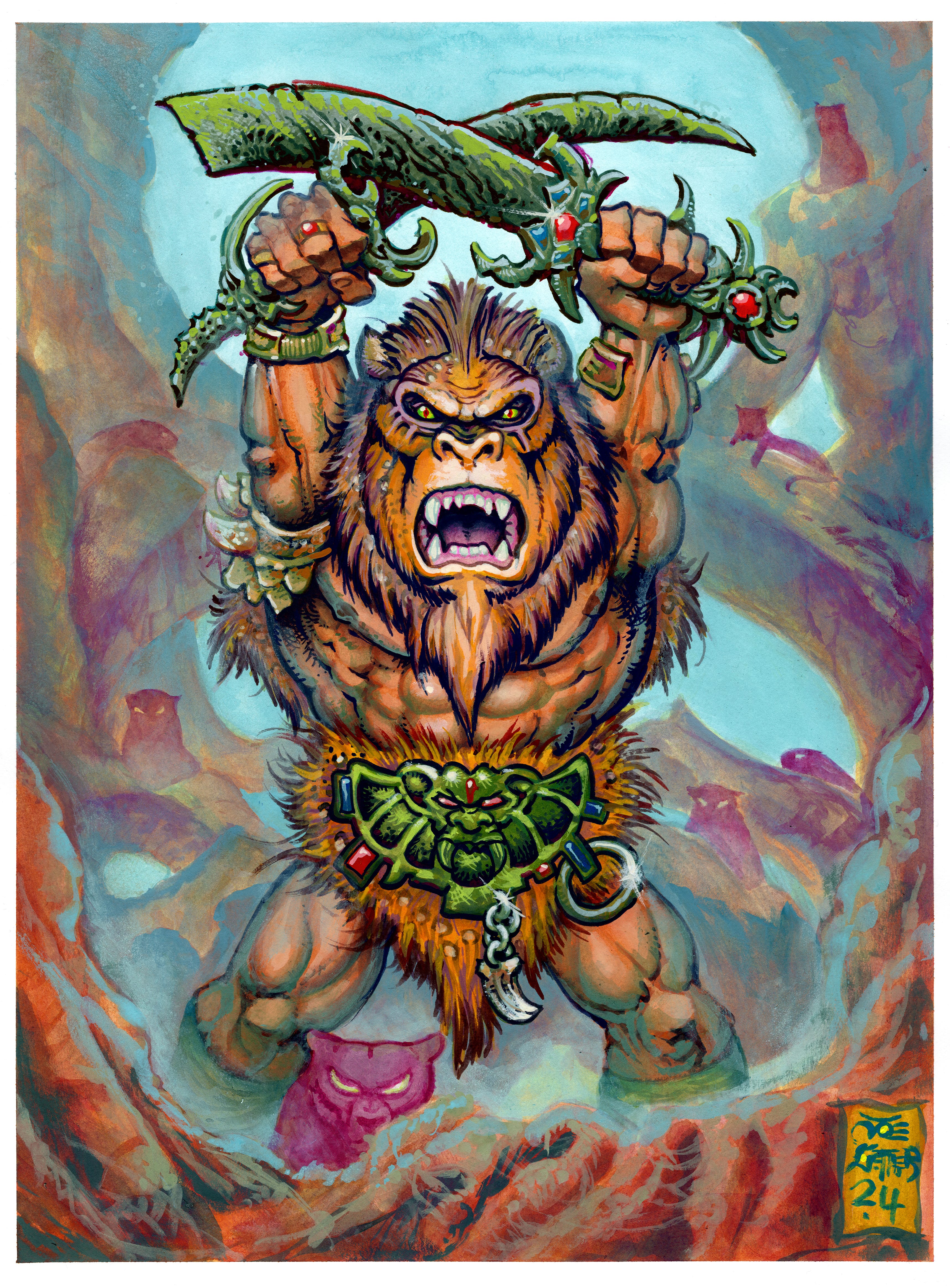
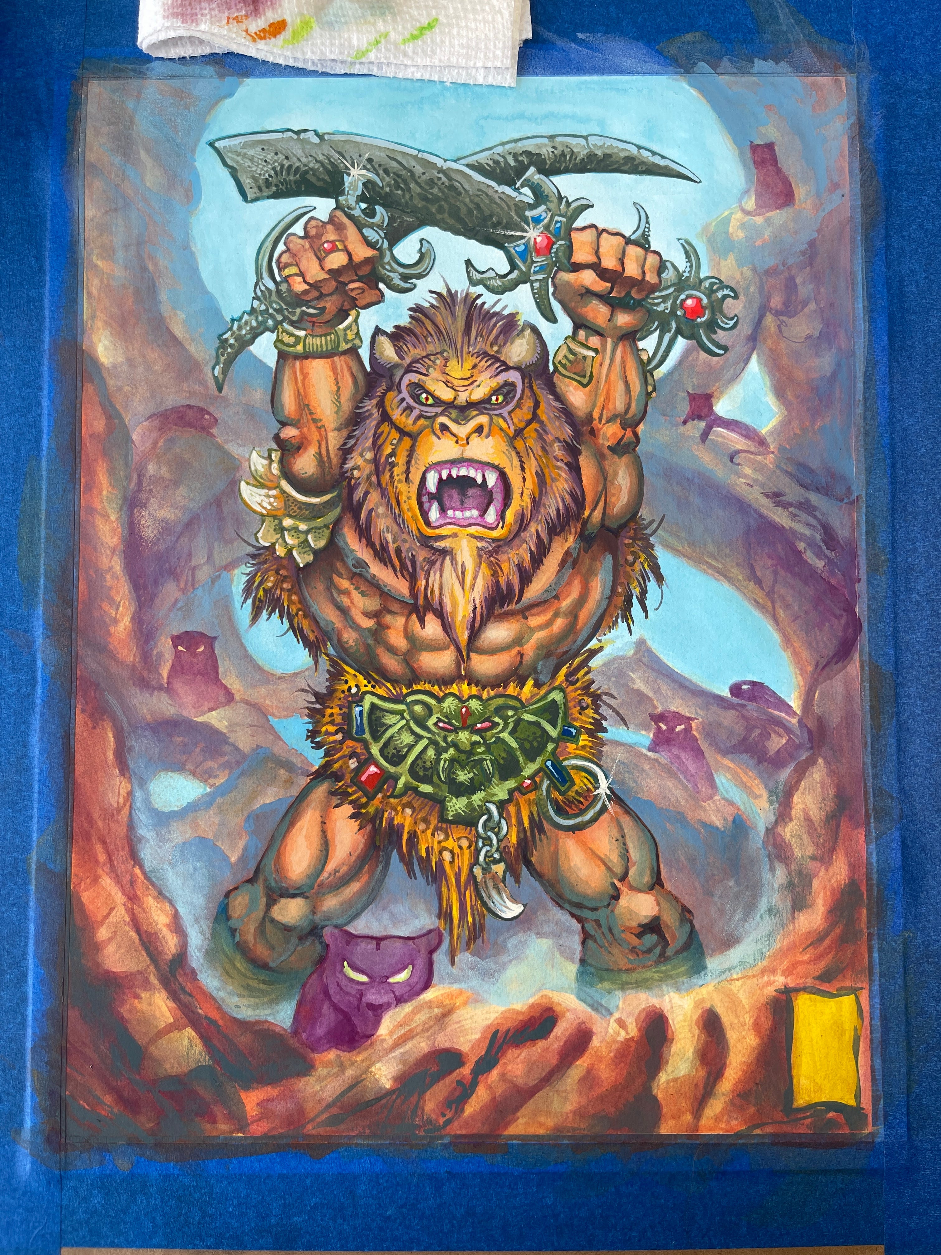
Here’s my painting entitled ‘Mask or Man’ ; made for the show. The theme of the show is “Transformation” and after awhile of thinking of what to make I thought of my fascination with the idea of the man-made mask or costume. The changing and exaggerating of a subject we may or may-not recognize into a heightened form for whatever it’s given purpose is. I always thought the subject was interesting. I will probably make a dedicated substack exploration on that one day. I digress! I Chose a few powerful images that I enjoy and frequent making like an ape, a warrior, and some kind of lion/jaguar mix to make some new thing. Is it a Mask or is this what the man’s transformed into? And he’s got some big cat pals around him as well. The final painting is 12x16”, acrylic gouache on watercolor paper. For this I used Winsor & Newton paper (Hot Press I think) and Holbein Acryla Gouache. Love that stuff.
The Break-Down!
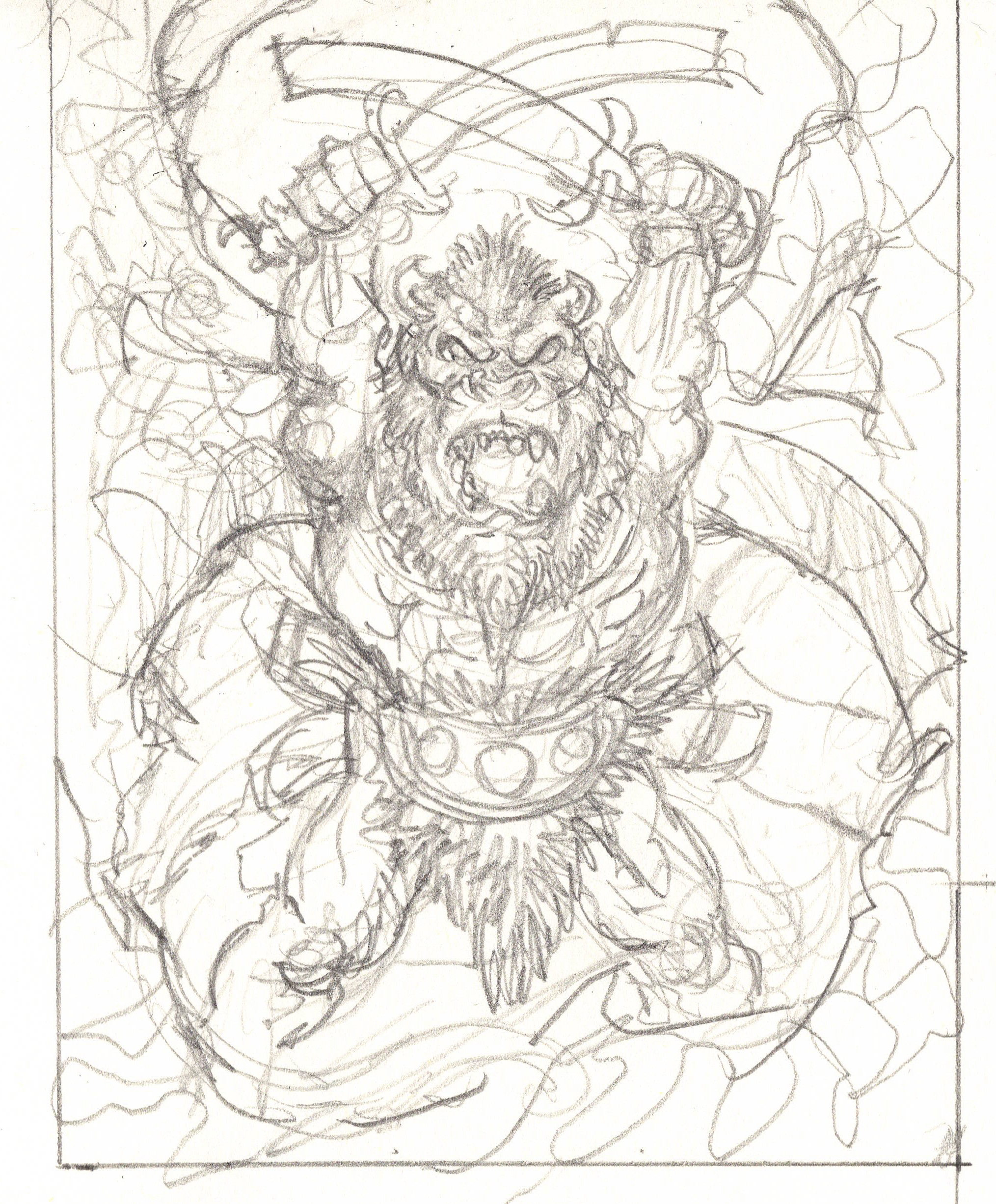
I usually make a ton of thumbnails (or small versions of the final idea hence THUMB-nail sized drawing) for most pieces that I bring to a finish. This time was no different; and I’d show you if I wasn’t planning on using some of those thumbnails for other future paintings. The drawing above is somewhere around 3”x4.5”. Just a super rough 3-5 minute drawing to get the initial shapes and flow going and to see if I like the design or concept.
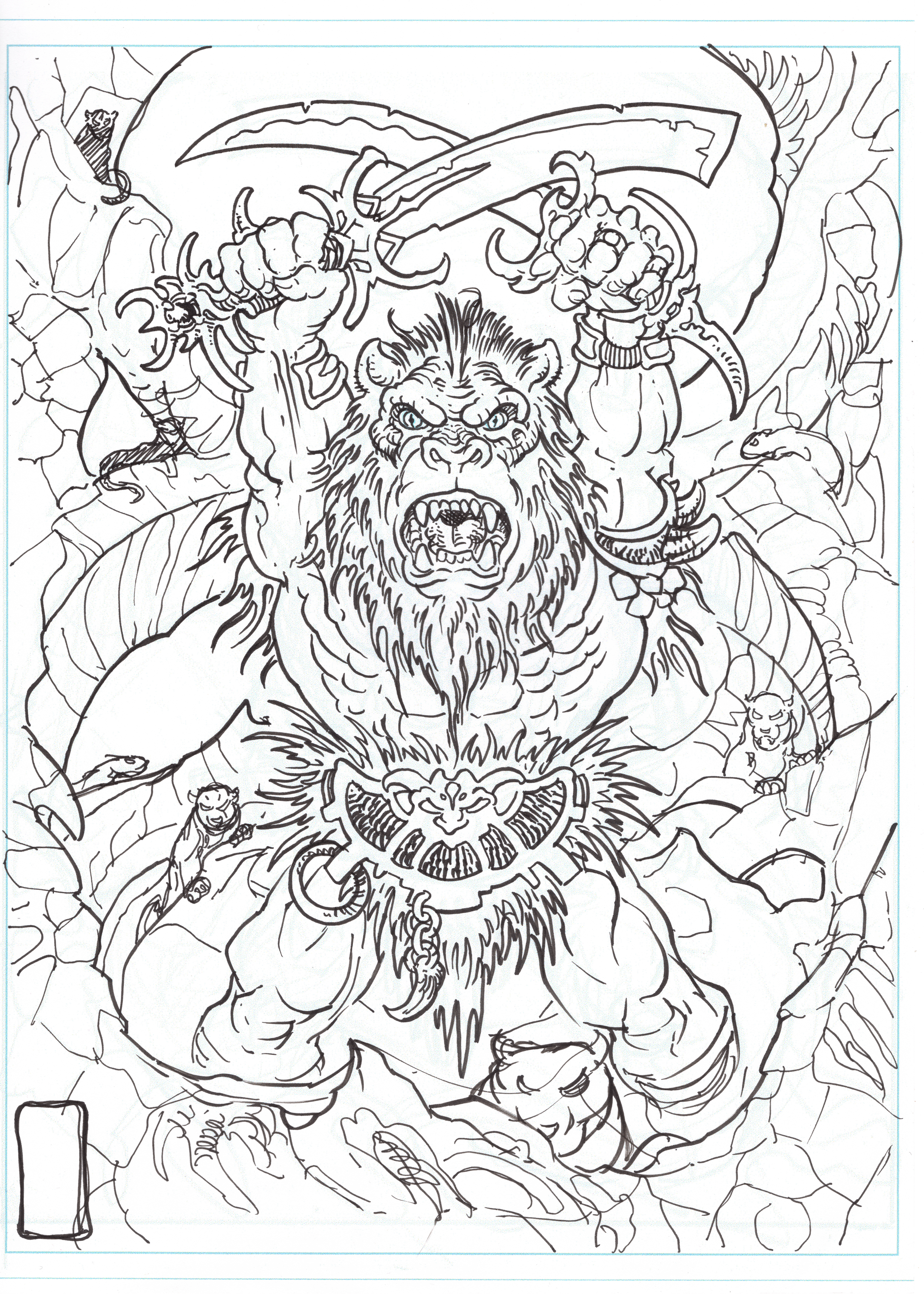
After the thumbnail is done I refined the sketch to this point. It still isn’t perfect, but for a painting in this style I’m just looking to get everything to generally sit in the right place. If it was ink and watercolor instead of acrylic gouache, I would have tightened everything up much more before moving on.
After the line-work is at this point; I print it out onto watercolor paper. I recently invested in an Epson Workforce printer that can print on thicker paper, and it’s a gigantic time saver to be able to print the drawing straight onto paper in these situations, instead of having to copy the drawing over and ink it again before painting.
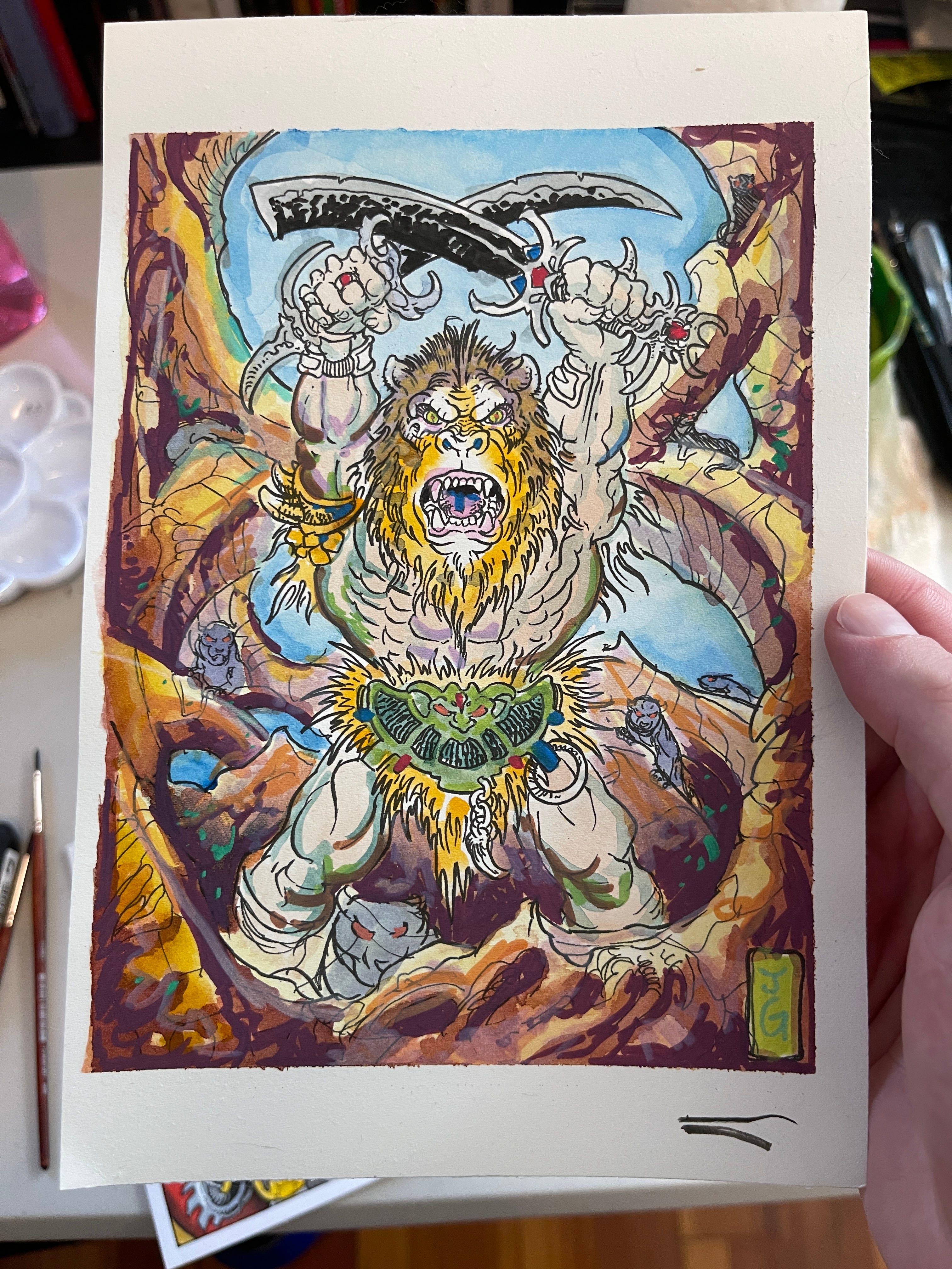
After the linework is finalized enough to move on, I made a quick watercolor study. I printed the linework out smaller on watercolor paper and tested out the colors that I’m thinking of using, so I can attack the painting aggressively when I’m working instead of having no plan, which can make the process of painting take ages. If I know how I’m going to approach something already, I will usually skip this step. For this study I did a bunch of watercolor washes and used acrylic markers to add some details wherever I needed something opaque.
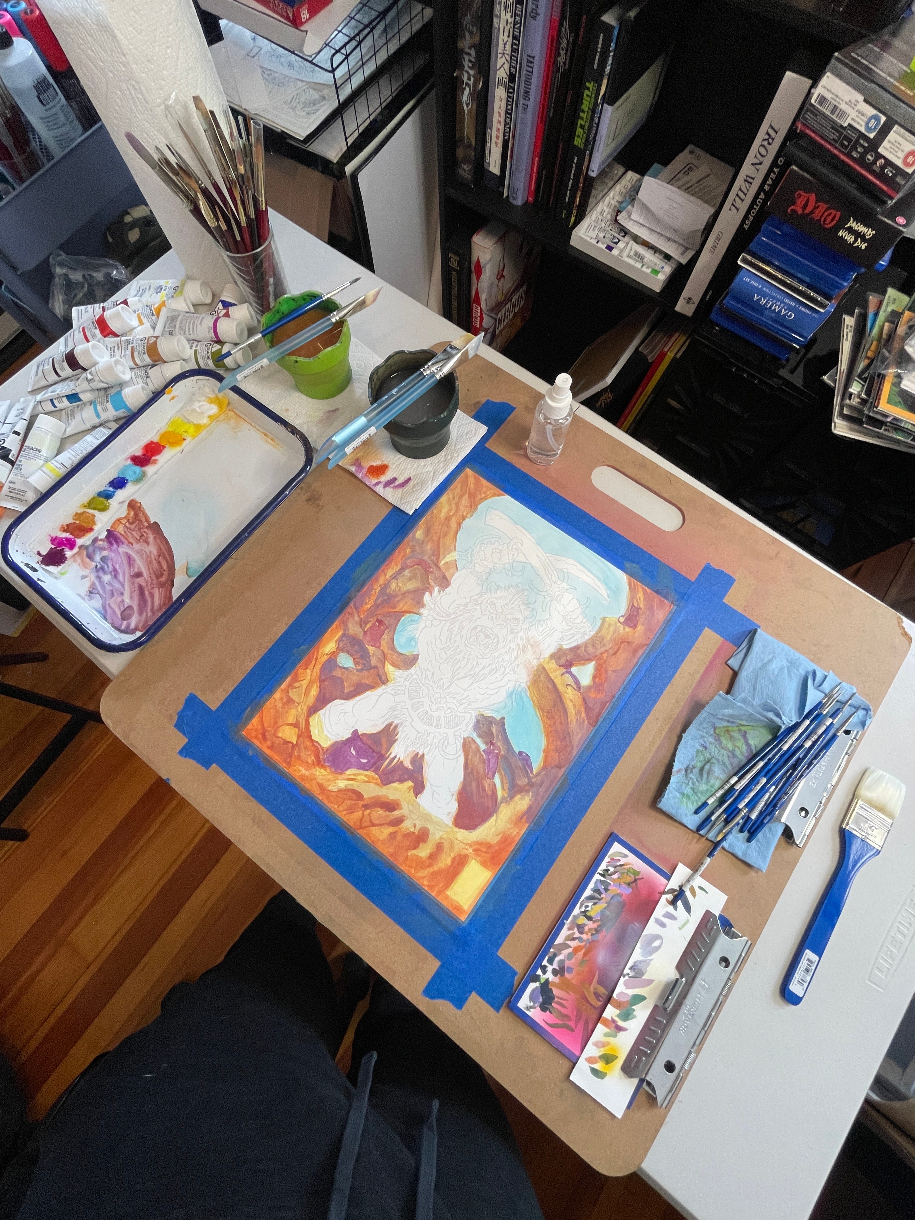
Here’s my setup that I use for most of my paintings. I tape the painting down onto this gigantic clipboard that I found laying around my parents house years ago, and get going.
A Bit about my Palette before we move on….
Whenever I use any water-soluble paint I always paint on a butcher tray. You can find them at most art stores and they come in different sizes. I generally use a warm and cool version of the primary colors (red, yellow, and blue) and then a few additional colors that I like to mix with frequently to save time. For me I usually add an olive green, a magenta, and some kind of a burnt sienna. It depends on the painting though! This painting has zero black in it. When I’m doing a painting like this style, I try as much as possible to stay away from any pure black or any pure white. Anything that looks like black is mixed from the colors available.
Reach out if anyone’s interested in this subject of color theory or which colors I use, I can go deeper into this kind of thing in a later post if anyone is interested!
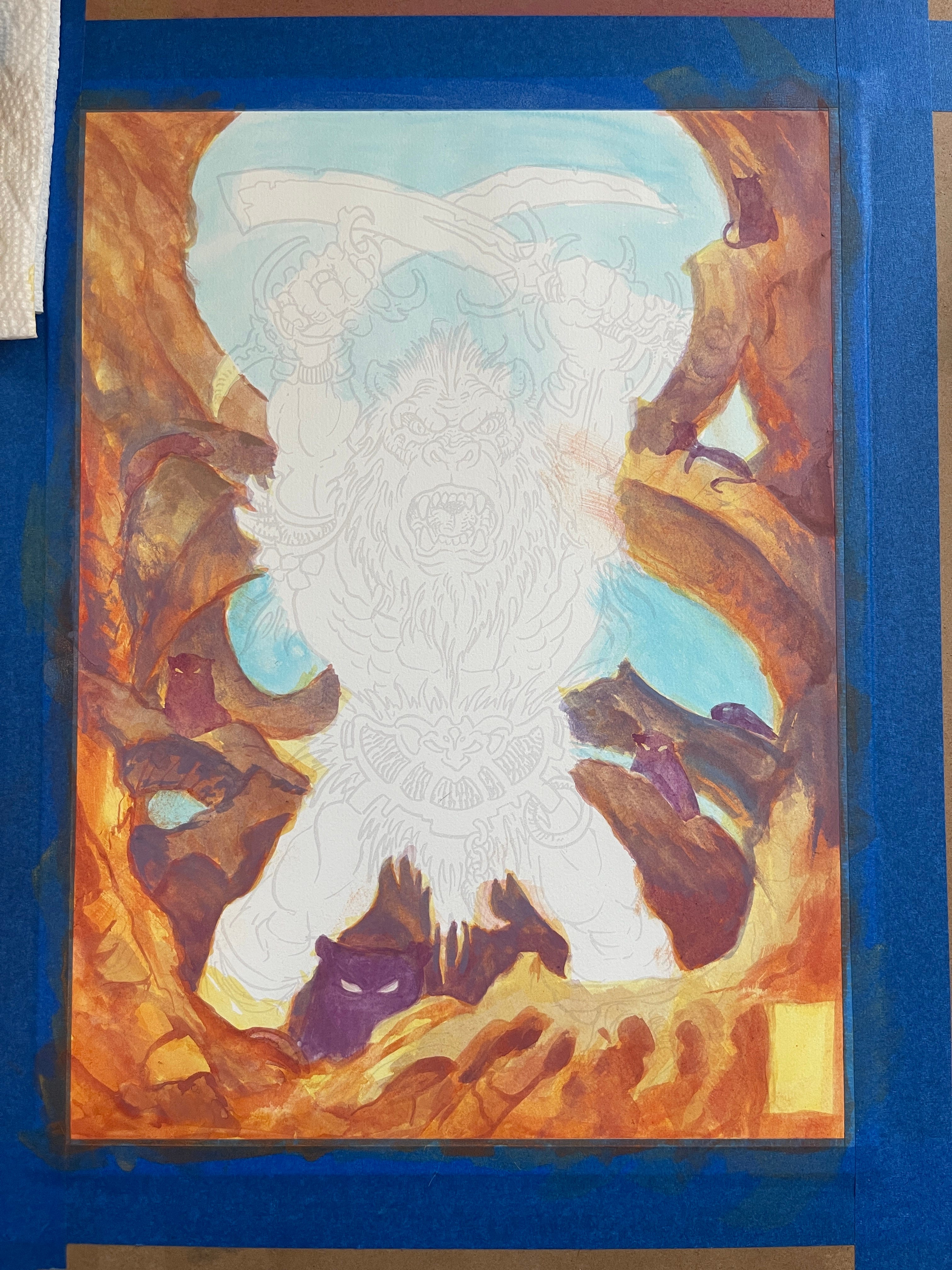
This is about 90 minutes of painting getting started. The beginning always goes big and fast. The whole painting started close to what the foreground looks like, and I started to add in some purples and blues to push the background further away from the eye. You can still see some of the printed sketch of the figure from my printer. I try to work background to foreground if possible, as the final details of the main subject always have to sit on top of everything else; and the background colors help inform the colors that make up the main subject.
At this point we’re probably about another 60-90 minutes along. I added more blues and pushed the background further away from the eye, and started to bring up the figure. I don’t feel like the background is done yet, contrary to my previous advice— But in this scenario I felt that trying to knock away any white on the paper will help me paint the rest of it better.
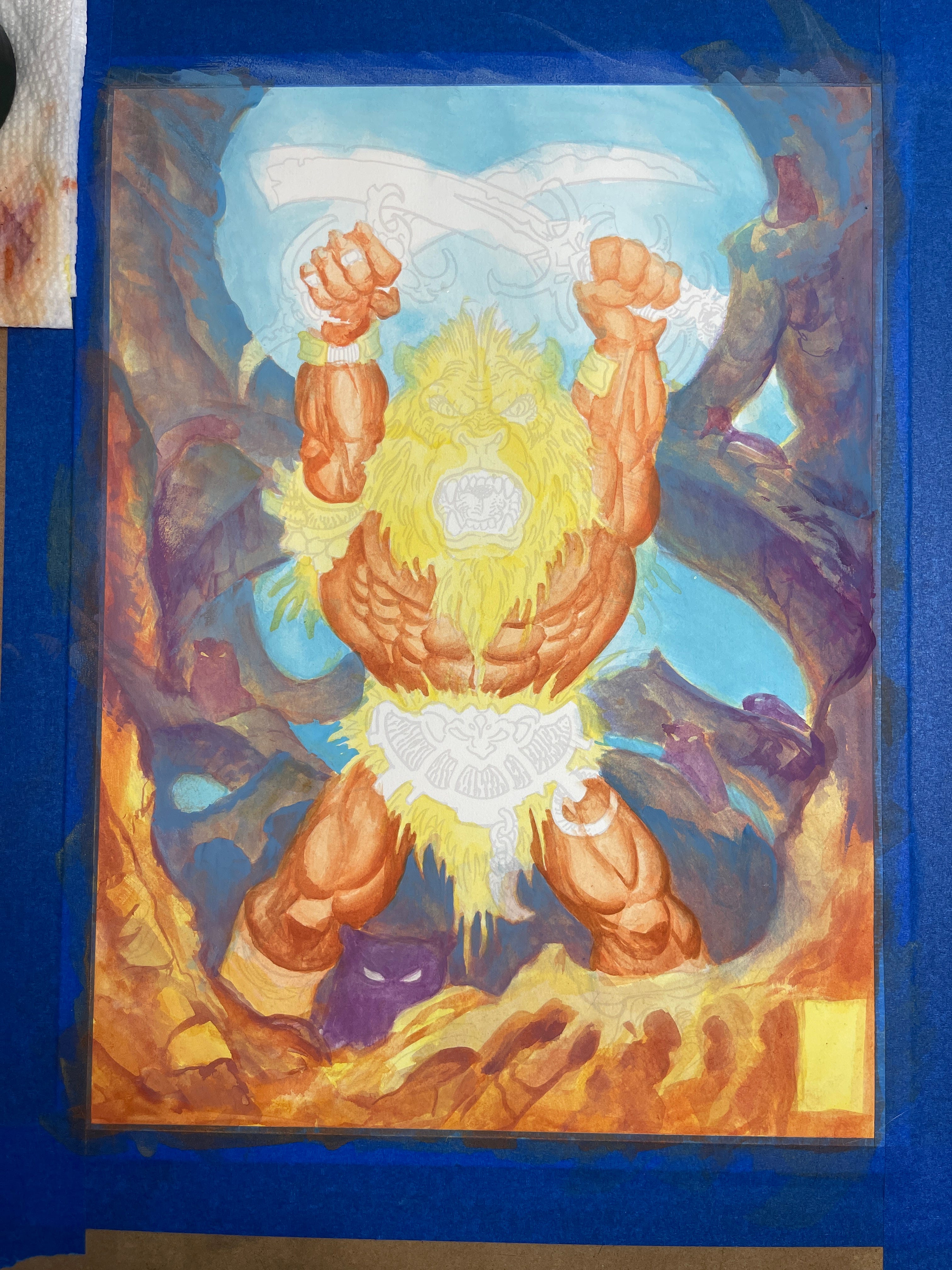
A few layers further and we’re really starting to see some vibrancy. I add some shadows and then do a wash over the whole figure to unify the mid-tones and shadows, making it all closer in value together. Highlights and whatnot will be added much further down the road. At this point; the white of the paper has almost completely been knocked out.
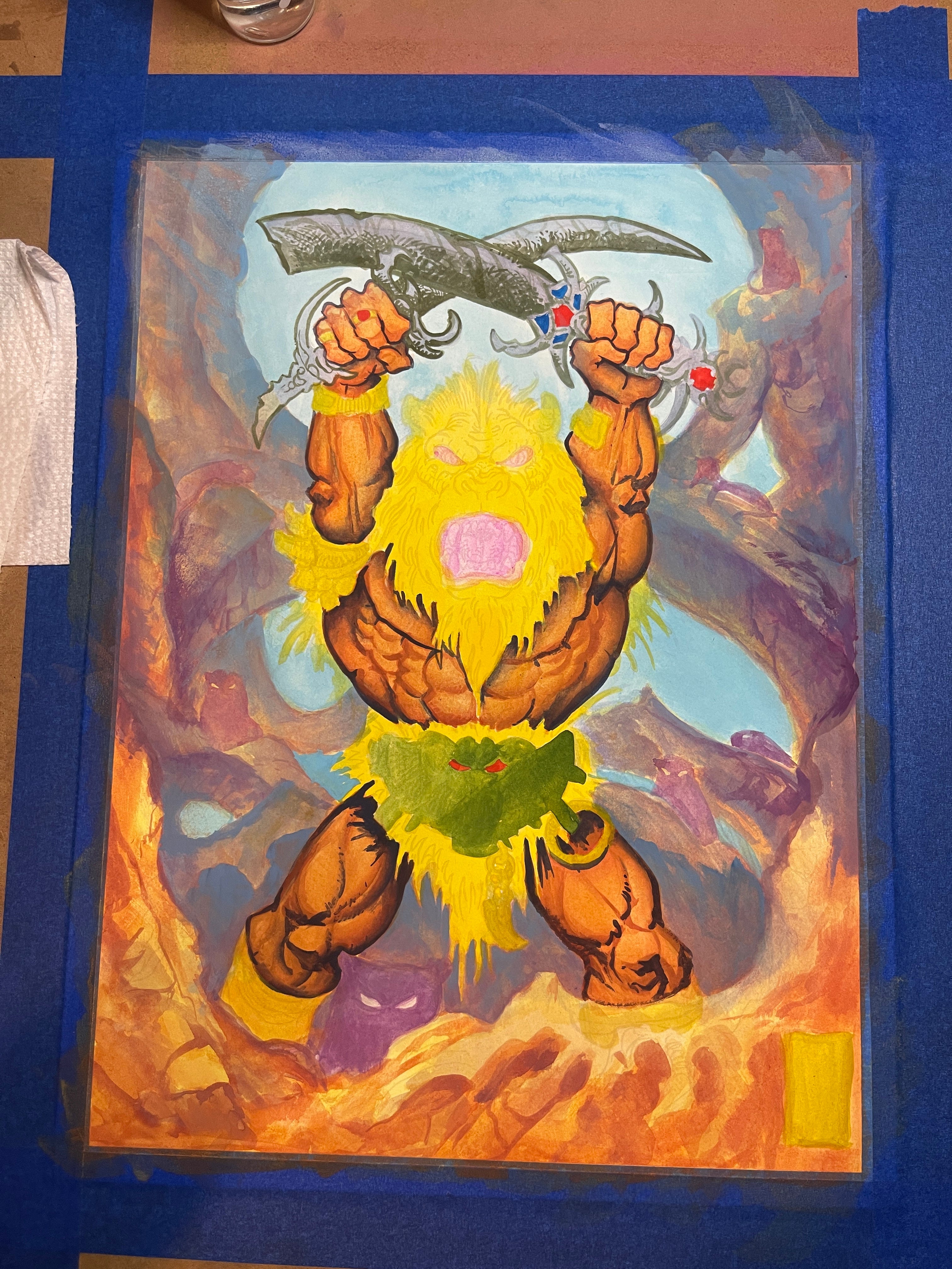
Starting to add deeper shadows in the body and bring in some shading on the blades up here. Also messing with textures for the swords while I do it, using an almost pen-and-ink style approach to figure it out. I knew I wanted them to have a biomech sort of feel, so I explored that a bit here.
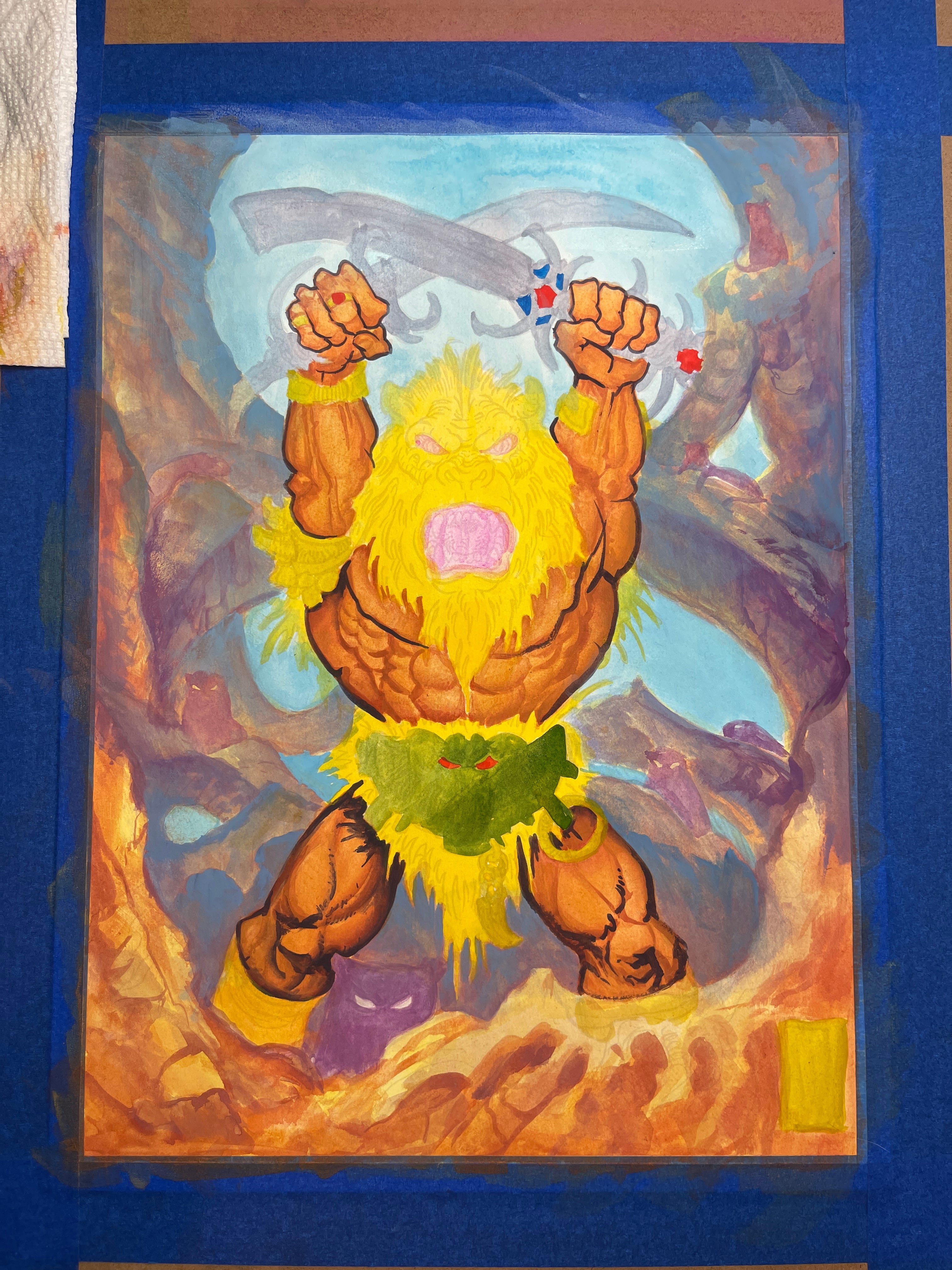
If you’re an artist yourself; you know that every painting has a low point that you’re not sure you can come back from. This was that point for me. The point in the painting where you say to yourself “OOH FUCK I should probably throw it out”. In these situations the only thing you can really do is just go headfirst to the best ability of your instinct on how to finish it. If I abandon it at this point, it will sit in a pile for 2-3 years before I even see it again and I’ll tell ya this: I’m not finishing it in three years. I do like the blue mist that I’ve added at his feet though.
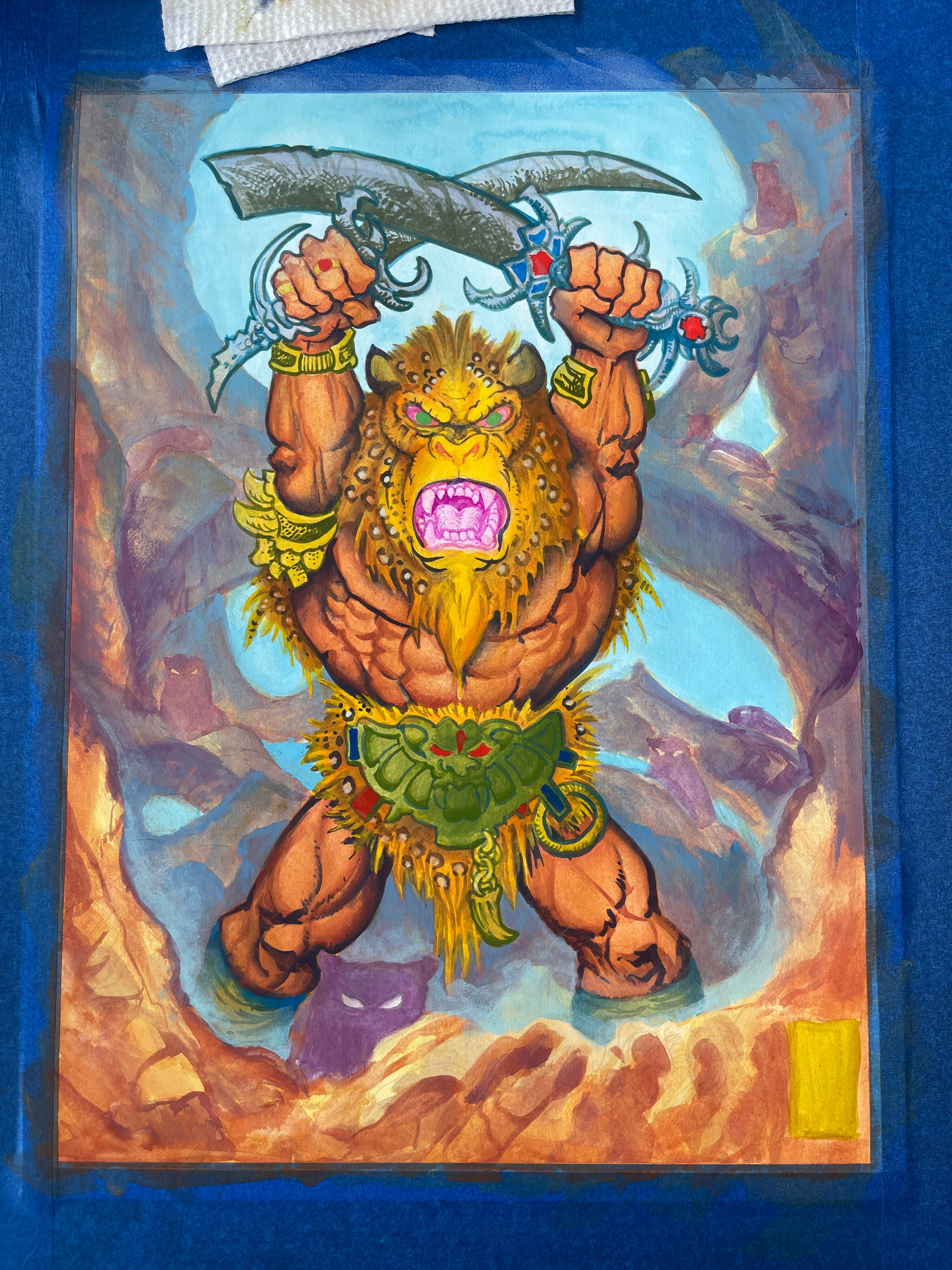
We’re getting close here. Starting to detail the figure more and add in fun color washes that I think might better sit the character in his environment. I start using smaller brushes around this step and start spending more time in concentrated areas.
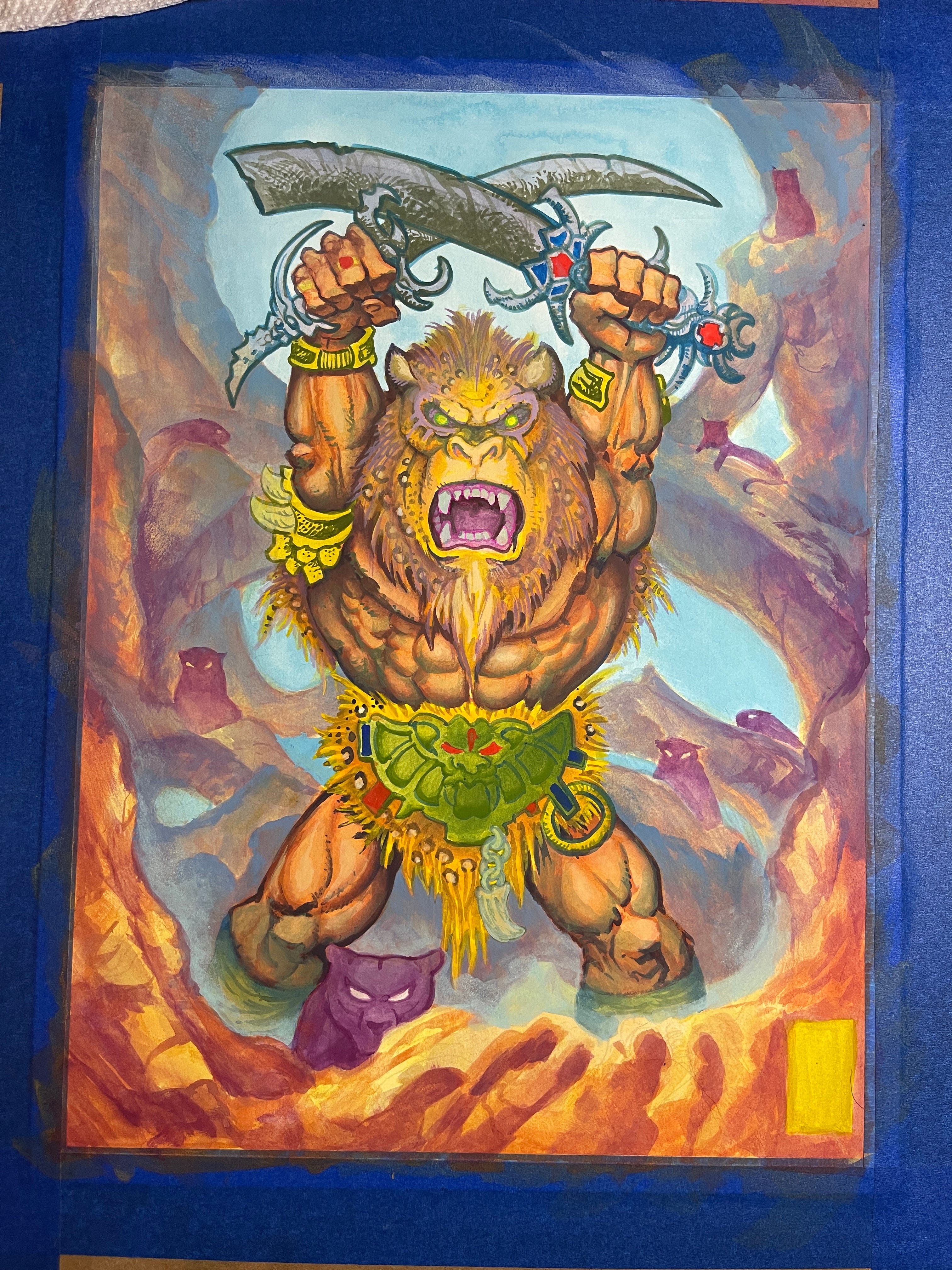
It’s almost done! And I could probably call it done if I wanted to. The foreground brightness of the rocks clashed a bit too much with the brightness of the figure, so I worked on that a bit and you’ll see even more of that in the final product.
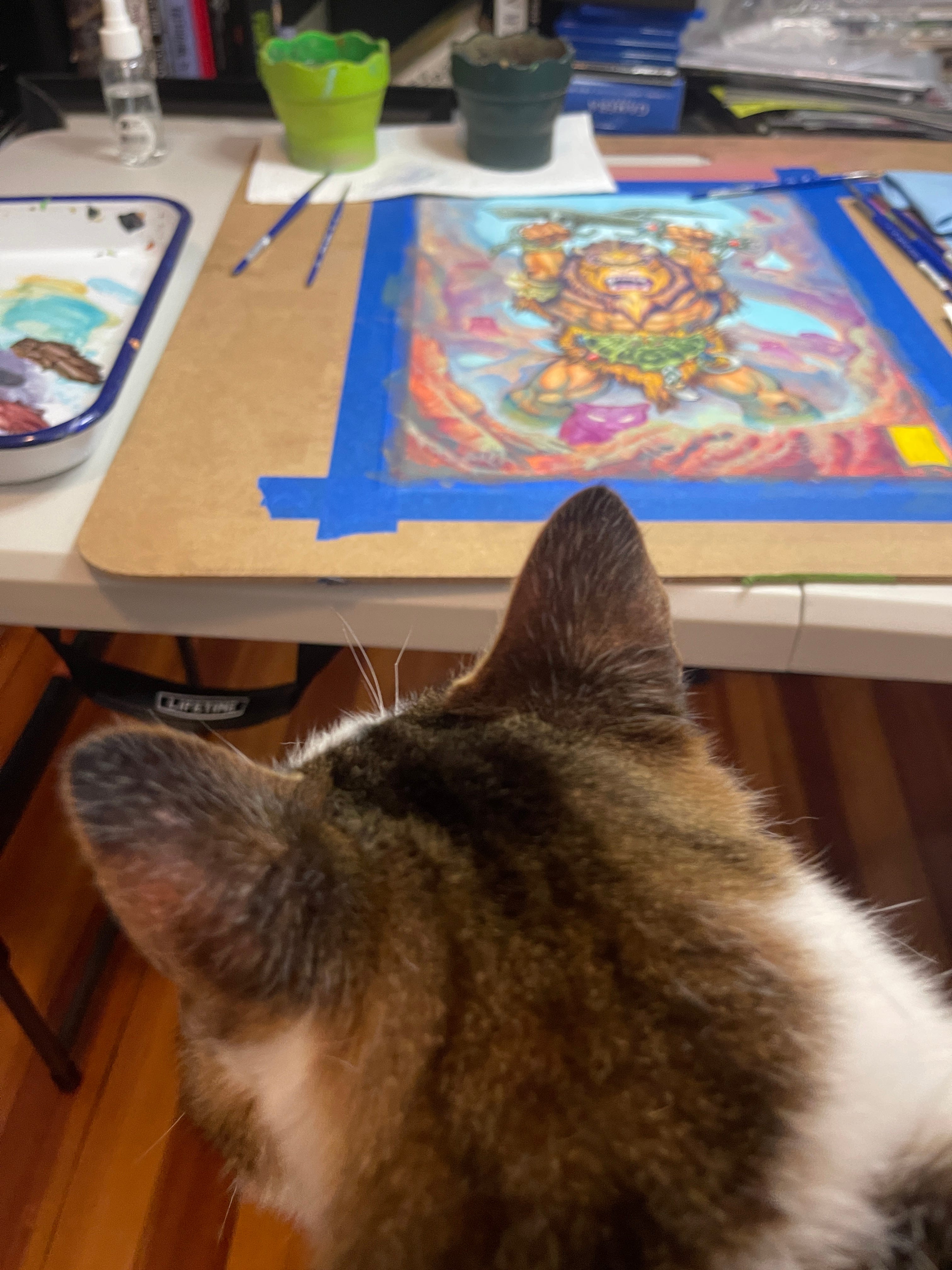
Miles is helping me finish everything up.
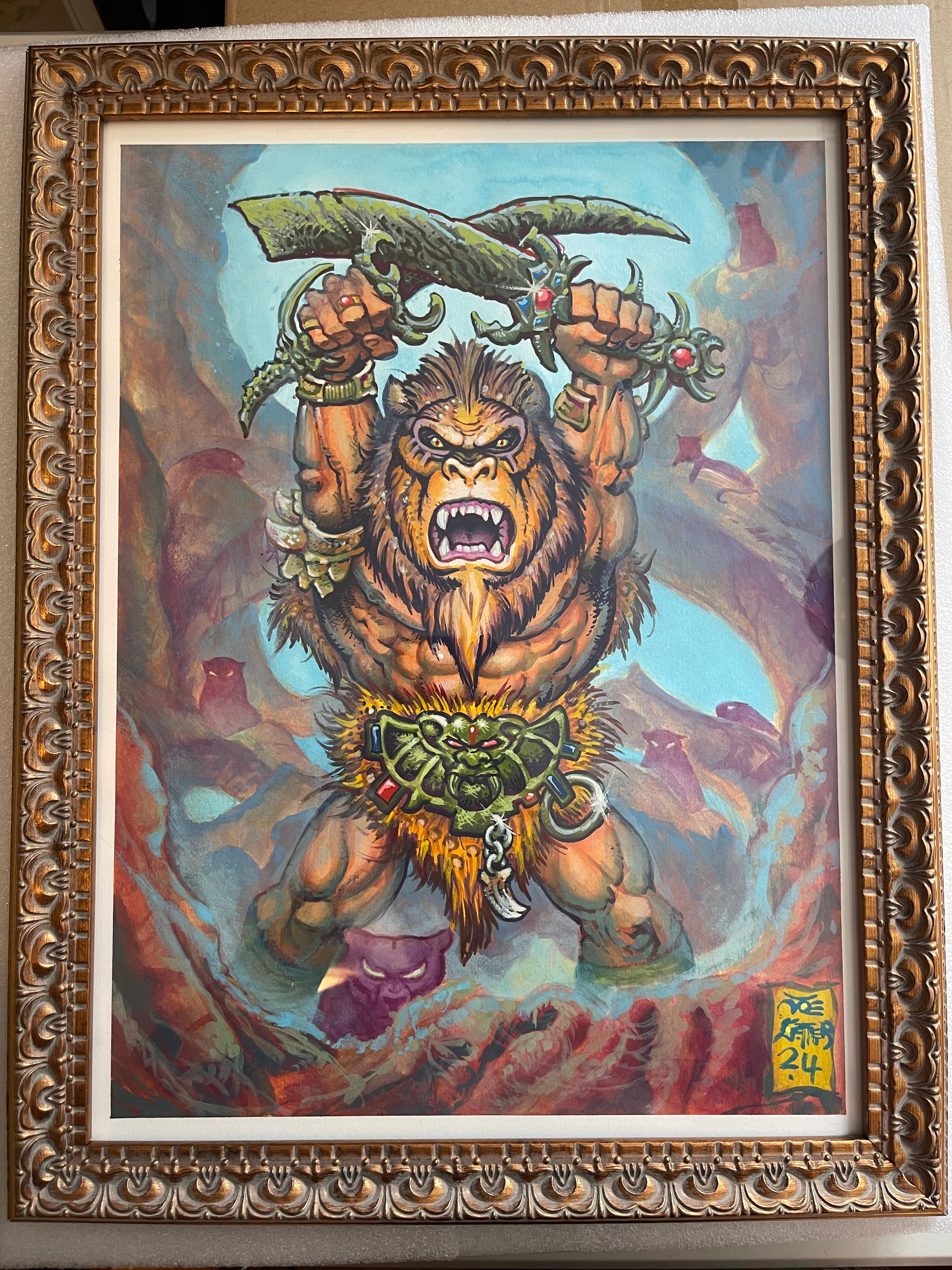
Here he is all framed up! Final textures and details have been added all around, and he’s ready to head off to the show. This painting is for sale through Worship Tattoo as well, get in touch with them if you’d like to own it!
Thanks for reading this far and checking out my second post. Like I said earlier, I will have a post with a lot more pieces of artwork and some tattooing coming soon for anyone waiting on that kind of thing. Hope to see some of you at the show tonight!
Very interesting read and look at the artistic process. Felt like I actually learned something. Thanks for sharing.